

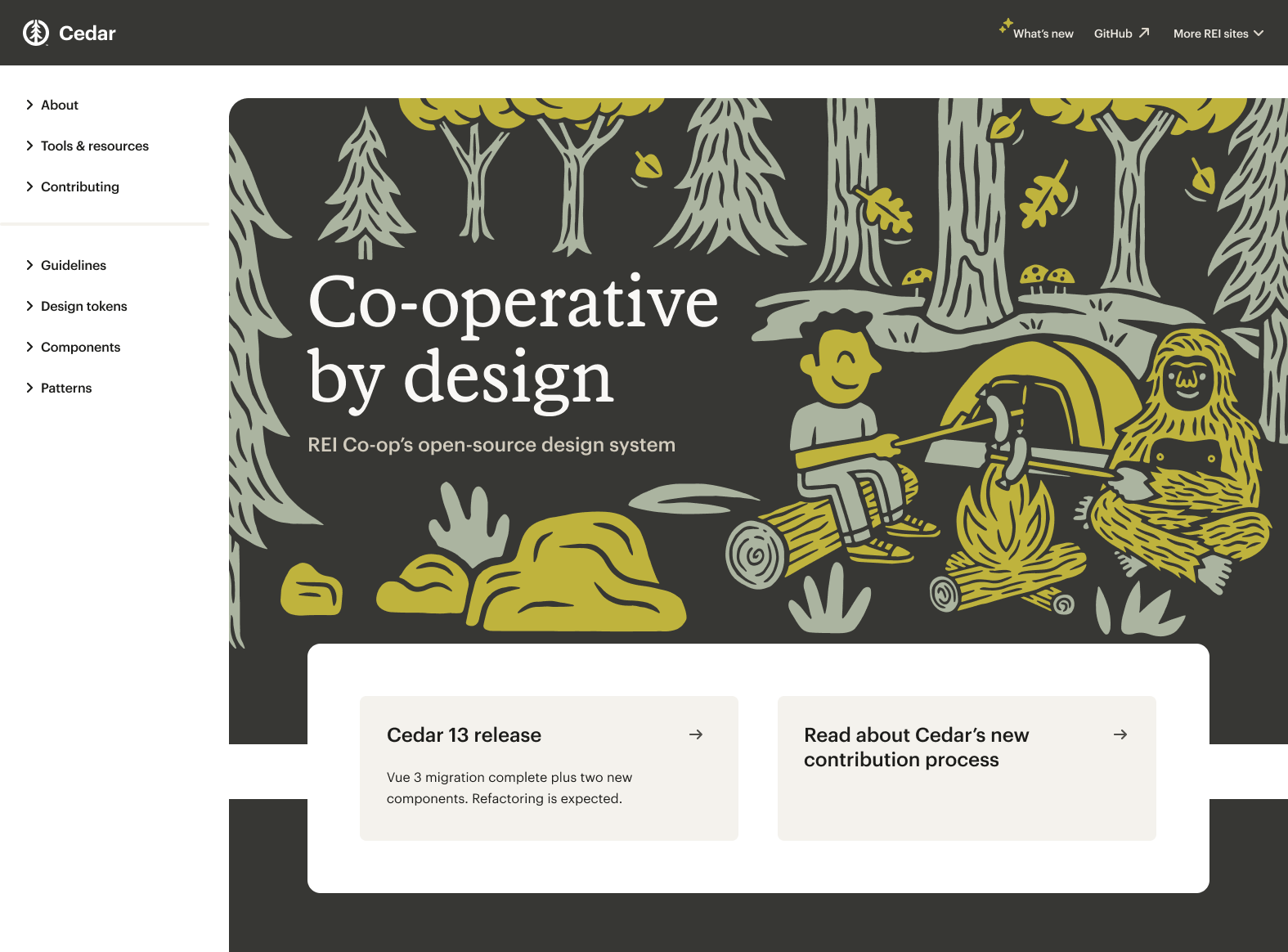
REI Co-op
This outdoor company has been growing and expanding their Design System, Cedar. Working collaboratively across multiple teams and platforms, I led a team implementing enhancements, education, components and patterns into the system using best practices, research, testing and learning.
Team
Technology Lead
Product Manager
Front-End Developers
Product Designers
Content Designer
Role
Principal Product Designer
01 Guidance & knowledge
Problem
The Cedar website was growing increasingly hard to maintain, didn’t visually represent the system or brand, and was challenge for our users. With multiple opportunities to scale on the horizon, we saw an opportunity to test a multi-themed design token architecture using a fresh experience.
Empathizing & planning
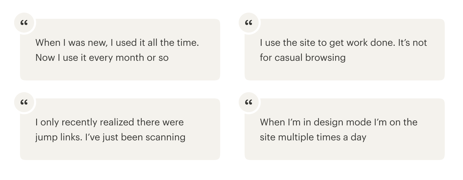
Key findings were crafted through a number of cross-disciplinary user interviews. By chatting with users, key concepts and features were surfaced, which were presented to the Cedar team. In order to move forward, I then hosted a workshop for the team to align on the project roadmap and next steps.
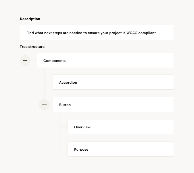
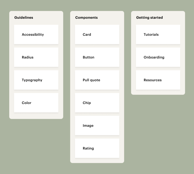
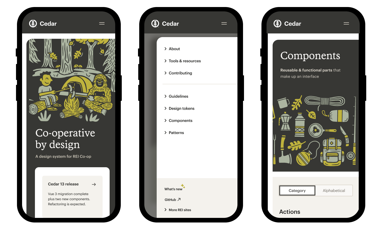
Information architecture
Through card sorting and tree testing we found opportunities to users a more robust picture of how the elements of the system were related. We also found ways to future-proof the navigation for a scalable future.
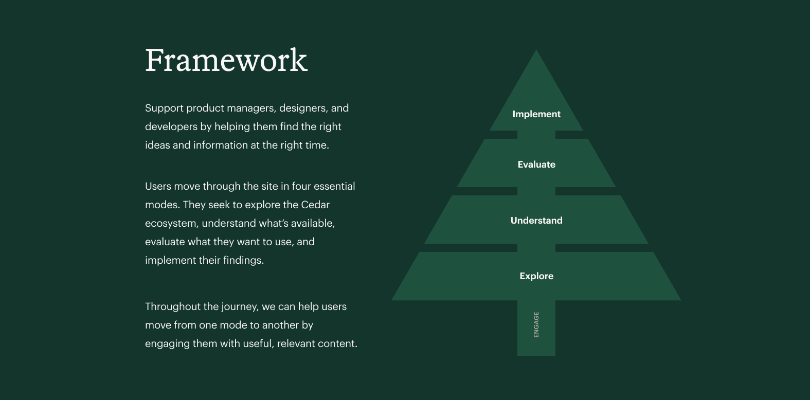
Content framework
Based on research, we identified a steps in the journey that help users achieve their goals. We found that users move through the site based on what content they need, which we broke down into explore, understand, evaluate, and implement. This gave us a framework for how broad or technical to be, how to talk about the concept, and structure each page.
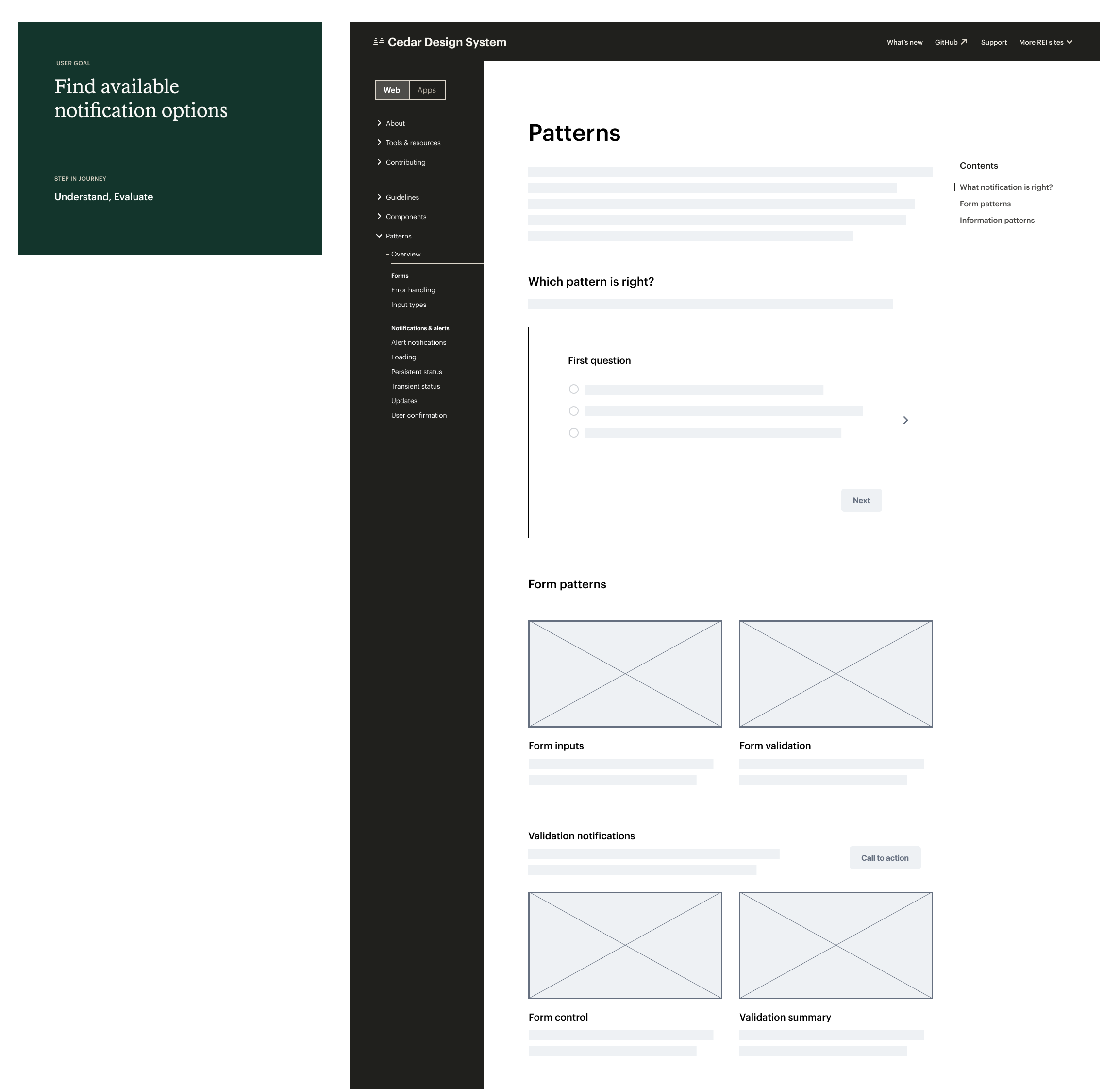
Flows & wireframes
User flows were identified, allowing for rapid prototyping. We used prototypes to align efforts across the team, document emerging patterns, identify content gaps, and break down the work.
Breaking down barriers
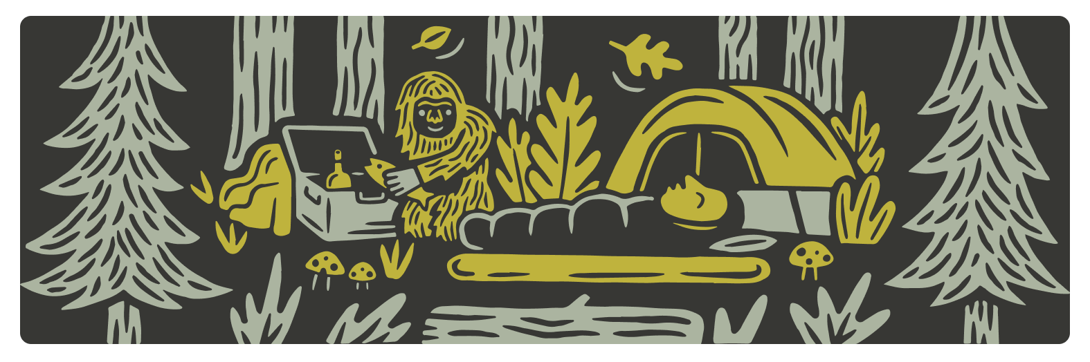
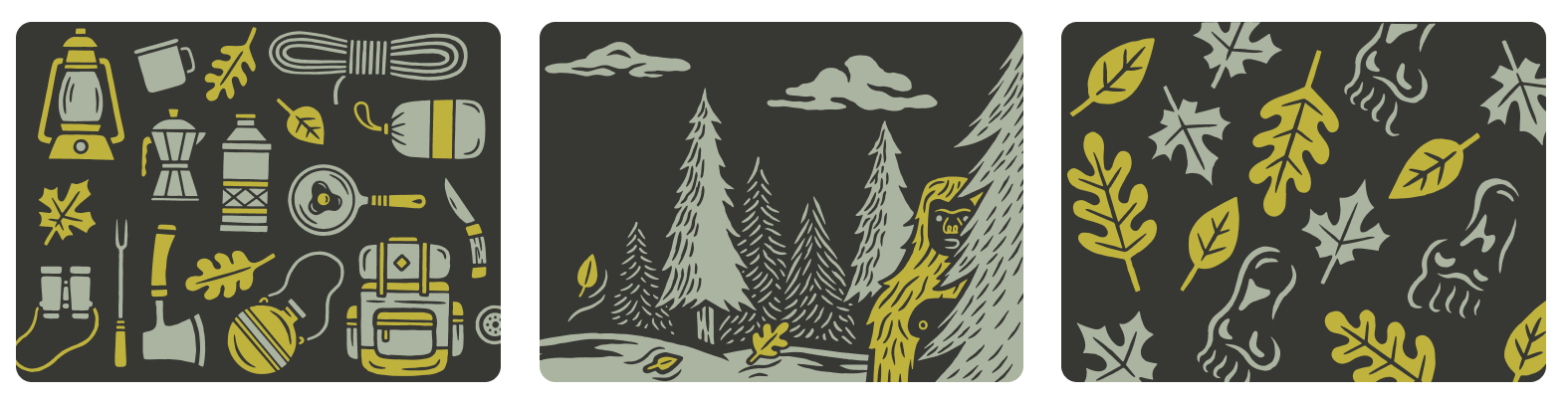
In order to build relationships and work collaboratively, we looked at the role of design throughout REI Co-op—physical product, store, and product graphics—to help define the visual expression of the site. We were lucky enough to work with REI’s talented group of product illustrators to create custom graphics for the site.
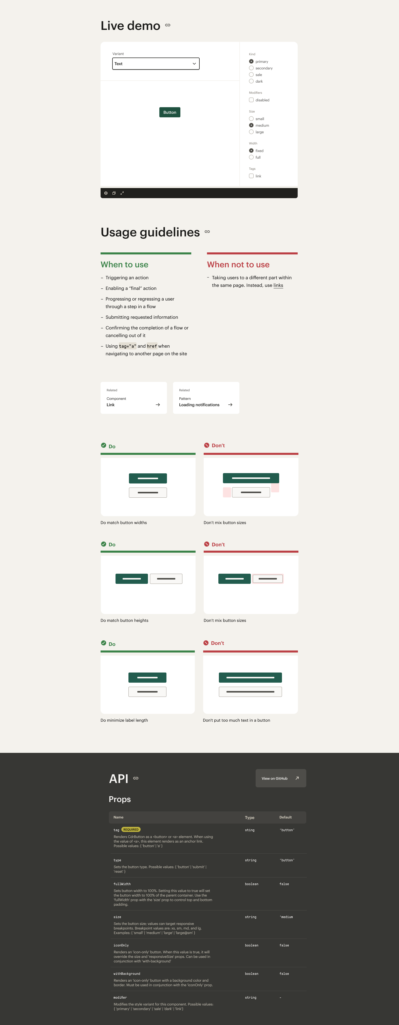
Detailed design
To bring shape to the design, we thought about the structure of REI stores. Take all the product out of stores, and they’re a solid backdrop to house and showcase the product. Similar to stores, the documentation site is there to house our product—the code and UI that express all the manifestations of the brand.
Outcomes
The site has yet to be released, but through usability tests, we found the new architecture, robust linking system, and design provided users with ways to move through the site quicker and with more confidence.

02 Brand & marketing changes
Marketing revealed a new brand, including type and color changes. We explored optimal usage across the site, updated usage guidelines, and assisted 3rd party teams on how to use the new brand.

Testing
We experimented and tested typography and color, ensuring we were providing enhancements and not disrupting the overall infrastructure. Based on extensive testing, we made determinations on size, font weight, line height and other text properties based on UX and accessibility best practices.


Color framework
We created an extended palette with the brand palette, to support interaction and accessibility requirements.

We created a framework for the palette, experimenting with bezier curves to provide the right amount of lights, mid, and dark tones in the palette.

Based on the bezier curve we created a series of tints and shades to support interactive states and created a warm grey palette to replace the flat black to white palette.

Application
We then applied the palette to components, testing for accessibility requirements along the way.

testing color
To answer questions about whether the new application fit within the intended brand tone, we tested using a desirability study.


In assessing the data, there was no meaningful difference in task completion, perceived ease of task, and alignment to intended brand tone. However, when asked which variable worked best for an outdoor company, participants overwhelmingly chose green tones. This allowed us to make a decision as a team and quickly move forward.
Outcome
In applying these changes, we were able to increase the speed on multiple pages using the system, aligned to the brand for a more cohesive experience, and create a more accessible experience for all.

03 Components: cards
The goal: standardize and define cards across various sites in order to give users a common experience across REI’s ecosystem. We started by auditing the REI ecosystem and defining cards across the ecosystem.

Definition
Based on auditing cards across the experience, we crafted a definition to differentiate them from other similar elements throughout the ecosystem.

Outcome
The card pattern led to a more cohesive experience for uses and allowed designers & developers to more easily use the component.

